• Sign Up! To view all forums and unlock additional cool features

    Welcome to the #1 Explorer ST Forum and Explorer ST community dedicated to Explorer ST owners and enthusiasts. Register for an account, it's free and it's easy, so don't hesitate to join the Explorer ST Forum today!


Reverse Views on the Upgraded 10.1 Screen

Messages
11
Reactions
6
Points
2
Location
Jacksonville FL
Vehicle
2022 Explorer ST RWD
#1
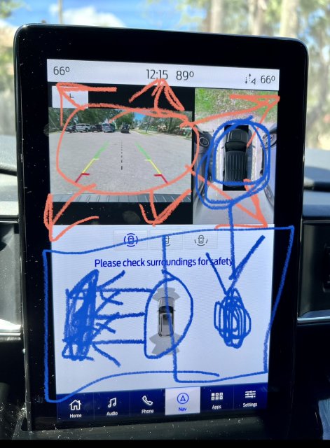
I cannot for the life of me figure out how Ford signed off on the layout of the screen when you put the vehicle into reverse. By default, the rear camera is so tiny and occupies less than 1/4 of the screen. Then over to the right there’s the 360 camera. Which is taking up another small portion. Then there’s the bottom half of the screen. It’s entirely occupied by the tiny proximity sensor display, what a waste of real estate!! The kicker is that of course you can hit the button to make the reverse camera the whole top half but when you start the vehicle and put into reverse it takes an extended amount of time for the buttons to appear. I have come up with the perfect default layout shown below. The reverse camera should take up the entire top half by default. The bottom half should be split down the middle, left half for the proximity display, right half for the 360 camera. This just makes SO much more sense. I would love to have a chat with the guy or gal at ford that signed off on the terrible stock design.

may I present my very rough looking mock-up:
 

Attachments

Last edited:

hbalek

Active Member
Messages
947
Reactions
530
Points
232
Location
Kensington, MD, USA
#2
I cannot for the life of me figure out how Ford signed off on the layout of the screen when you put the vehicle into reverse. By default, the rear camera is so tiny and occupies less than 1/4 of the screen. Then over to the right there’s the 360 camera. Which is taking up another small portion. Then there’s the bottom half of the screen. It’s entirely occupied by the tiny proximity sensor display, what a waste of real estate!! The kicker is that of course you can hit the button to make the reverse camera the whole top half but when you start the vehicle and put into reverse it takes an extended amount of time for the buttons to appear. I have come up with the perfect default layout shown below. The reverse camera should take up the entire top half by default. The bottom half should be split down the middle, left half for the proximity display, right half for the 360 camera. This just makes SO much more sense. I would love to have a chat with the guy or gal at ford that signed off on the terrible stock design.

may very rough looking mock-up:
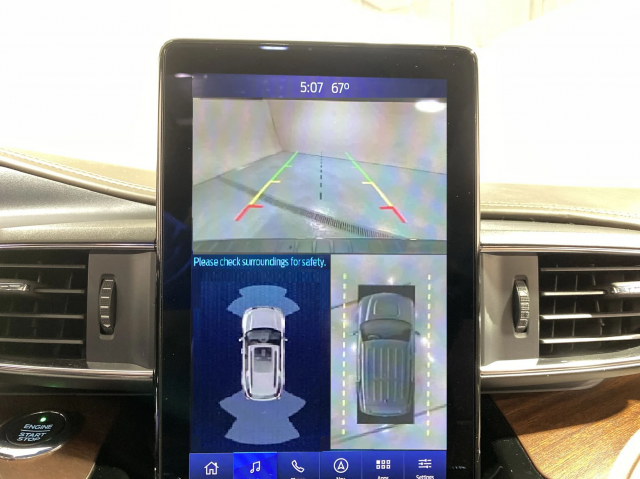
I agree! This has been discussed ad nauseam here since 2019 and Ford has done nothing to change it so far. It's really sad but you get used to it! I did a little mock up myself:

1669010704102.png
 

Last edited:
OP
RWD22ExplorerST
Messages
11
Reactions
6
Points
2
Location
Jacksonville FL
Vehicle
2022 Explorer ST RWD
Thread Starter #3
I agree! This has been discussed ad nauseam here since 2019 and Ford has done nothing to change it so far. It's really sad but you get used to it! I did a little mock up myself:

View attachment 15219
Your mock up is AMAZING I just don’t understand why they didn’t do that from the factory. It makes PERFECT sense.
 

st8

1000 Post Club
Messages
1,071
Reactions
477
Points
212
Location
Bel Air, MD, USA
#4
I agree you do get use to it but seriously, how does this pass and get approved lol it truly is comical at this point. I’ve adapted at this point seeing mock ups like this just blows my mind how ford managed to screw it up.
 

KegsBdry

Active Member
Messages
929
Reactions
415
Points
182
Location
WashDC
#5
Ford only invested in half of the screen. The rest is filler!


Top