• Sign Up! To view all forums and unlock additional cool features

    Welcome to the #1 Explorer ST Forum and Explorer ST community dedicated to Explorer ST owners and enthusiasts. Register for an account, it's free and it's easy, so don't hesitate to join the Explorer ST Forum today!


Is everyone ok with the giant tablet and terrible bezel?

KegsBdry

Active Member
Messages
929
Reactions
415
Points
182
Location
WashDC
#21
Mike, is there any way you could possibly resize your patch signature? I'm forced to scroll every time just to get past your signature block.
Ditto. To be fair, it does say TEXAS.
 

JohnE

Active Member
Messages
513
Reactions
281
Points
82
Location
Vancouver, WA, USA
#22
Mike, is there any way you could possibly resize your patch signature? I'm forced to scroll every time just to get past your signature block.
I was going to ask the same thing but was trying to come up with a diplomatic approach like yours LOL!
 

Messages
90
Reactions
39
Points
17
Location
Skunk Hollow
#23
Took it out. Still can't figure out why it is so large on this forum.
 

Messages
90
Reactions
39
Points
17
Location
Skunk Hollow
#25
She will stay. :love: To bad the picture is cropped. Truly a dynamite young lady. Classmate of my oldest boy and his wife. Two really great kids. Both by different men. She keeps trying to hook up with Mr America types. Not wise IMHO.
 

FPO

New Member
Messages
5
Reactions
2
Points
2
Location
Joliet, IL, USA
#26
I like the fact that when I have car play running I can see the radio station info. I hope they can do a software update to improve camera views But other than that it’s more useful than the screen my 17 explorer had.
 

Messages
1
Reactions
0
Points
1
Location
Ontario NY
Vehicle
2023 Explorer ST
#27
The vertical screen really isn't an issue. If any of you folks are used to a Mopar display, then hopefully you realize that this is like a crappy etch-o-sketch. Anyone commending this display, is really missing out. Thank you Ford, for going with the Fisher Price display.
 

st8

1000 Post Club
Messages
1,074
Reactions
479
Points
212
Location
Bel Air, MD, USA
#28
The vertical screen really isn't an issue. If any of you folks are used to a Mopar display, then hopefully you realize that this is like a crappy etch-o-sketch. Anyone commending this display, is really missing out. Thank you Ford, for going with the Fisher Price display.
It’s really the software implementation and UI that is the problem. But most car manufacturers fail in this regard. My mothers new rav4 hybrid infotainment system is garbage.
 

Toadster

Member
Law Enforcement
Messages
310
Reactions
189
Points
37
Location
Folsom, CA
Vehicle
'23 ExST, '17 Raptor, '16 FoST, FFR Cobra
#29
agreed, should be a no-edge table, that bezel is so 2005
 

Messages
50
Reactions
41
Points
17
Location
Felton, DE
Vehicle
2022 Explorer ST
#30
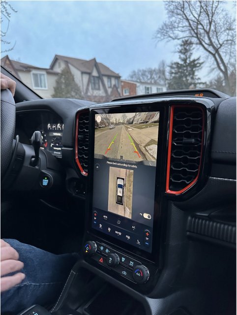
This pic is from someone on the Ranger forum who had access to a 2024 Ranger Raptor.
Screenshot 2023-03-12 071818.jpg
It's a 13" screen, but no reason our display couldn't be configured this way. I doubt we'll get an update for this, but it does show that Ford knows how to do it.
 

KegsBdry

Active Member
Messages
929
Reactions
415
Points
182
Location
WashDC
#31
This pic is from someone on the Ranger forum who had access to a 2024 Ranger Raptor.
View attachment 16866
It's a 13" screen, but no reason our display couldn't be configured this way. I doubt we'll get an update for this, but it does show that Ford knows how to do it.
They knew how to do it. They just started cutting costs. The information system is one of many places they dropped the ball.
Shame though. So much was poured into this Explorer.
 

TMac

1000 Post Club
Messages
1,706
Reactions
1,494
Points
262
Location
Knoxville, TN
#32
You realize Ford doesn't own Range Rover any more?
 

st8

1000 Post Club
Messages
1,074
Reactions
479
Points
212
Location
Bel Air, MD, USA
#33
They knew how to do it. They just started cutting costs. The information system is one of many places they dropped the ball.
Shame though. So much was poured into this Explorer.
Yeah, as usual everything comes down to money.
 

Sgt1411

Member
Law Enforcement
Messages
239
Reactions
151
Points
37
Location
BC&AZ
Vehicle
2021 ST
#34
Two SYNC updates over the past few months, nobody can see or feel a single difference or improvement......SYNC2/3/4 is the most poorly executed multimedia system in the industry. The fact that I have a 10" screen in front of me and they display a 2" RVC view is beyond ridiculous. On start up you can't touch anything for the first couple minutes or it locks up. I routinely disconnect my BT connection during a call so I can use the handset or the call will drop.

Get in a $38,000 Kia or Hyundai and see how much better their basic system is, Ford should be embarrassed.
 

Messages
107
Reactions
81
Points
27
Location
Las Vegas, NV
Vehicle
2022 Explorer ST
#35
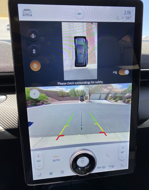
I don’t mind the size of the screen or that it looks like it doesn’t belong, but I hate Sync3 and the layout of the cameras. Probably wouldn’t bother me if it weren’t for the fact that I spend more time in my Lightning (old MME pictured) that got it right.

7A828093-8874-4E2E-B32D-F1B1403C4EA9.jpeg
 

Messages
58
Reactions
45
Points
17
Location
Florida
Vehicle
2020 Explorer ST
#36
Personally, I like it, I just hate the Sync 3 implementation on it. It doesn't use the real estate as nearly as well as it could. I would even be okay with Sync 3 itself (touch control speed/responsive, etc.), if it only used the area better. It's really meant for landscape-oriented displays. Otherwise, the placement itself is good IMO.
 

KegsBdry

Active Member
Messages
929
Reactions
415
Points
182
Location
WashDC
#37
I don’t mind the size of the screen or that it looks like it doesn’t belong, but I hate Sync3 and the layout of the cameras. Probably wouldn’t bother me if it weren’t for the fact that I spend more time in my Lightning (old MME pictured) that got it right.

View attachment 16882
Minus that hideous knob on the screen. Who green lit this setup? :poop:
 

Messages
58
Reactions
45
Points
17
Location
Florida
Vehicle
2020 Explorer ST
#38
Minus that hideous knob on the screen. Who green lit this setup? :poop:
I'm not a fan of the touch screen controls for the air con. Makes it impossible to change anything without taking your eyes off the road. I much prefer certain controls (such as volume, air con) to have a physical knob/button that can be located by feeling for it. Something I think the ST got right. I think the mixture of physical controls vs. touchscreen controls is well balanced, and the really important stuff can be located quickly and then adjusted without requiring me to keep my eyes there. (y)
 

Messages
32
Reactions
35
Points
12
Location
NYC
#40
I'm on my 2nd ST (2020, now 2023) I did get used to it, but I still don't like the design. Occasionally it freezes, it is a Ford.


Top